
AT: This will be the 40th anniversary of the New York Islanders and a third jersey seems logical and expected. However, I have to question the decision to go the black route. To me, black jerseys for a team that does not have black as a main color just tells me that this is a cash-in. A ploy to get more cash for the team through merchandising. This is the New York Islanders, a team with a rich history in a very unique location. I don't believe that black is necessarily the best path. However, I did see a design a few weeks ago that I fell in love with:
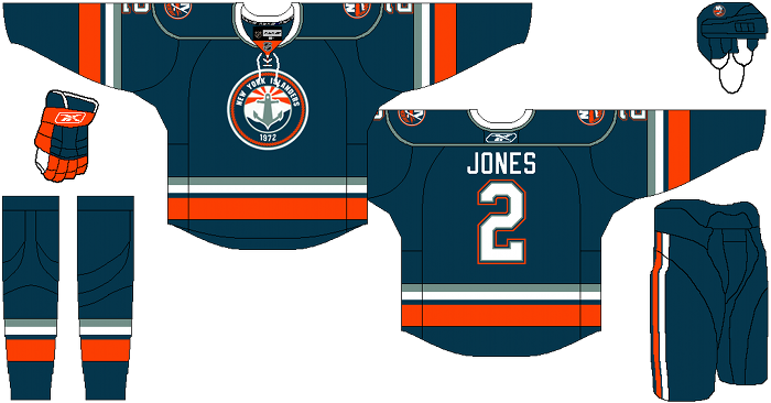
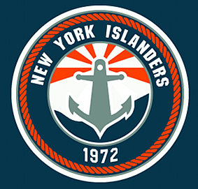
I fell in love with this design when I first saw it. I believe it was done by the user Darkhorse on HFBoards. This is what the Isles should be going for. They tried going for the nautical theme (and we all know how that went) once before, but this does it while still keeping the classic Islander feel. A logo that gives tribute to this great island with no huge changes in the color scheme and generally a great look. I would buy a jersey like this in an instant. I really hope the Isles make the right decision here. They have to know that a black jersey would not be well regarded.
CH: Agreed here with Alex - black would be an absolute horrendous choice by the Islanders. This team was born blue and orange and that should never change. Remember when they tried teal in the mid-90's? Terrible. I understand why the Islanders want a third jersey. It's a total moneymaker, but the design needs to make sense and it needs to coincide with the team's history. If they want to make it orange, fine, I can live with that. But black is just not what the Islanders are about. It never will be. Terry Goldstein, his staff, and the organization needs to realize this and scrap this idea. Go with the 1993 design. Go with the 1980 design. Could even go with the concept that Alex posted. Just don't change the blue and orange.
No comments:
Post a Comment